SKUNK-FUNK Dance Jam Party Promo Video
To create the video, I first edited and formatted all of the images. Then, I saved them as an animated GIF file. I wanted to dedicate approximately :30 seconds to each band... one has four members the other has almost twice that at seven. This fact informed my decision to create the graphics that promotes the auction artwork, the "Best dance floor on the North Shore" and the all ages audience. Starting the video with these images and repeating them mid-way through gave me the filler content I needed to transition from one band's music to the other's.
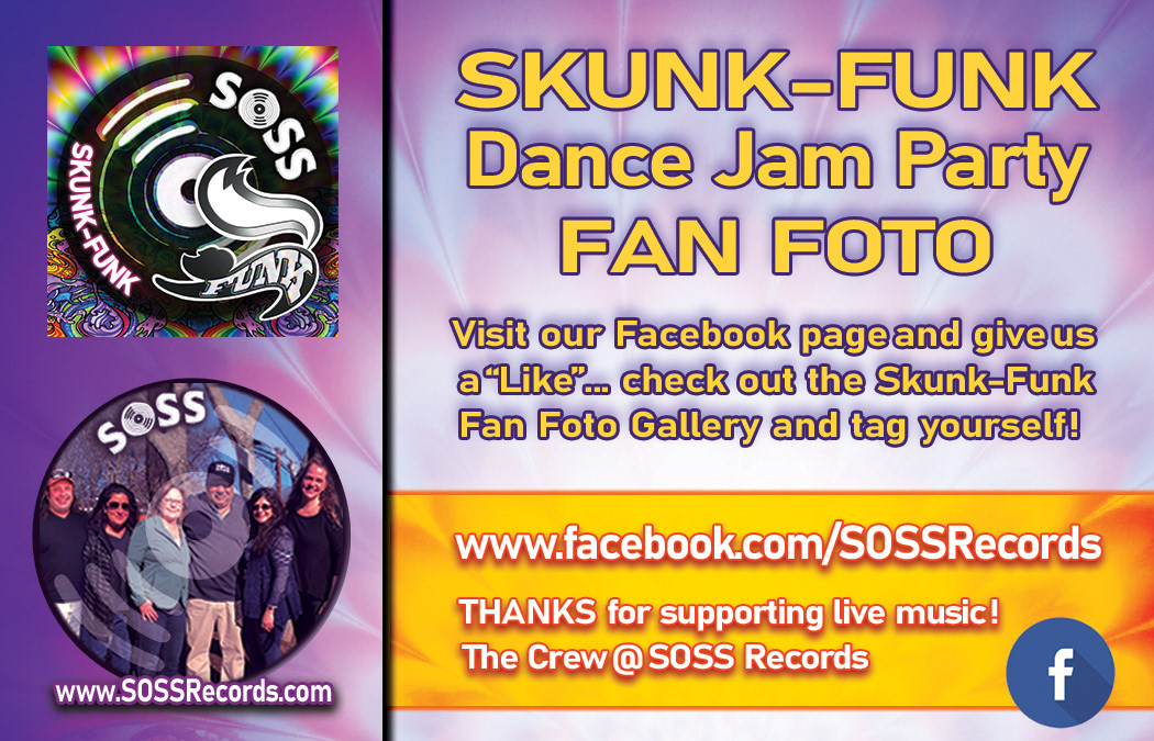
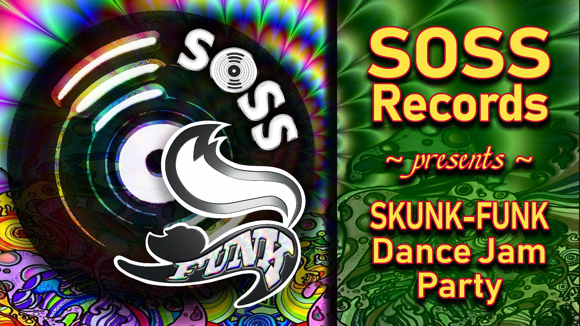
Event Social Media Graphics
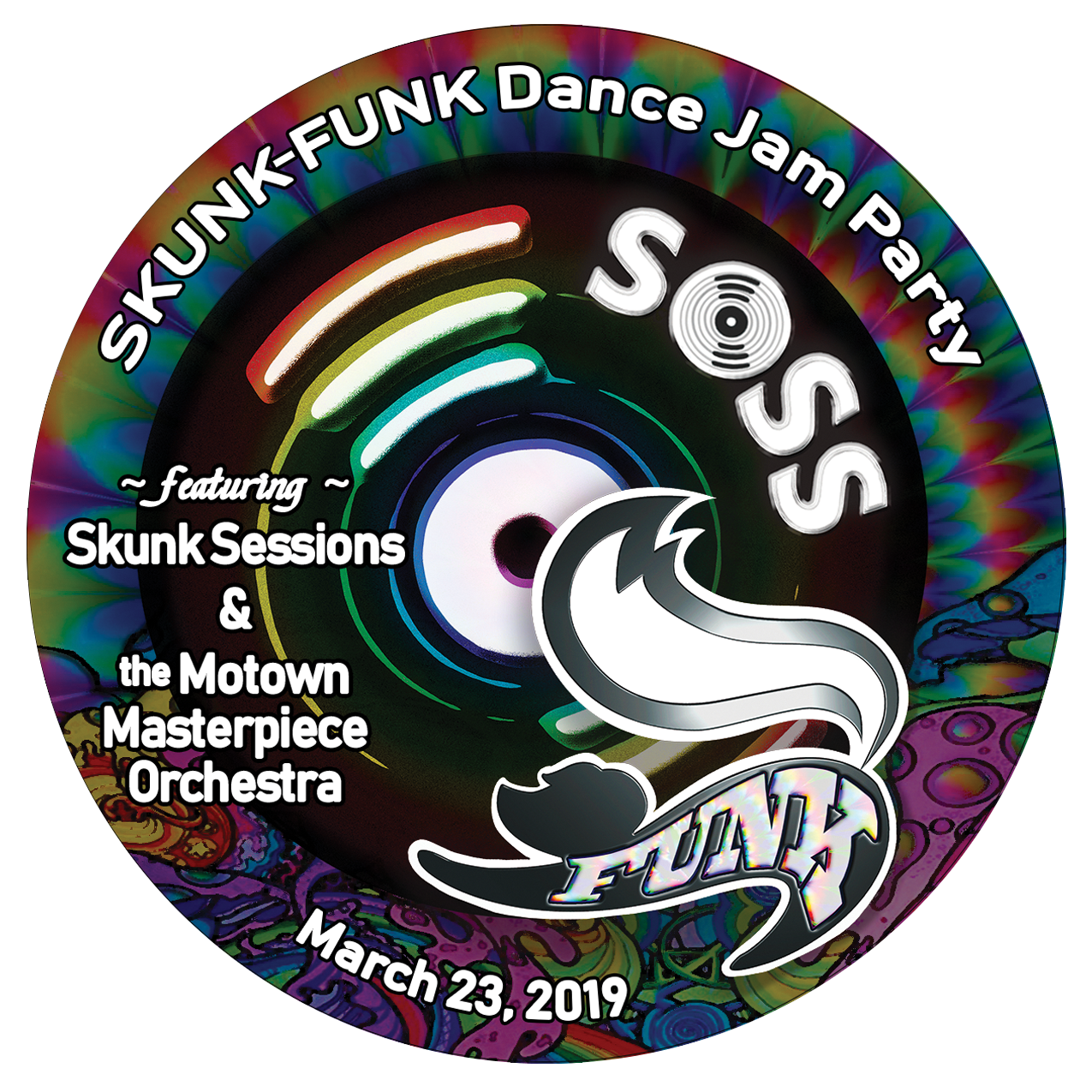
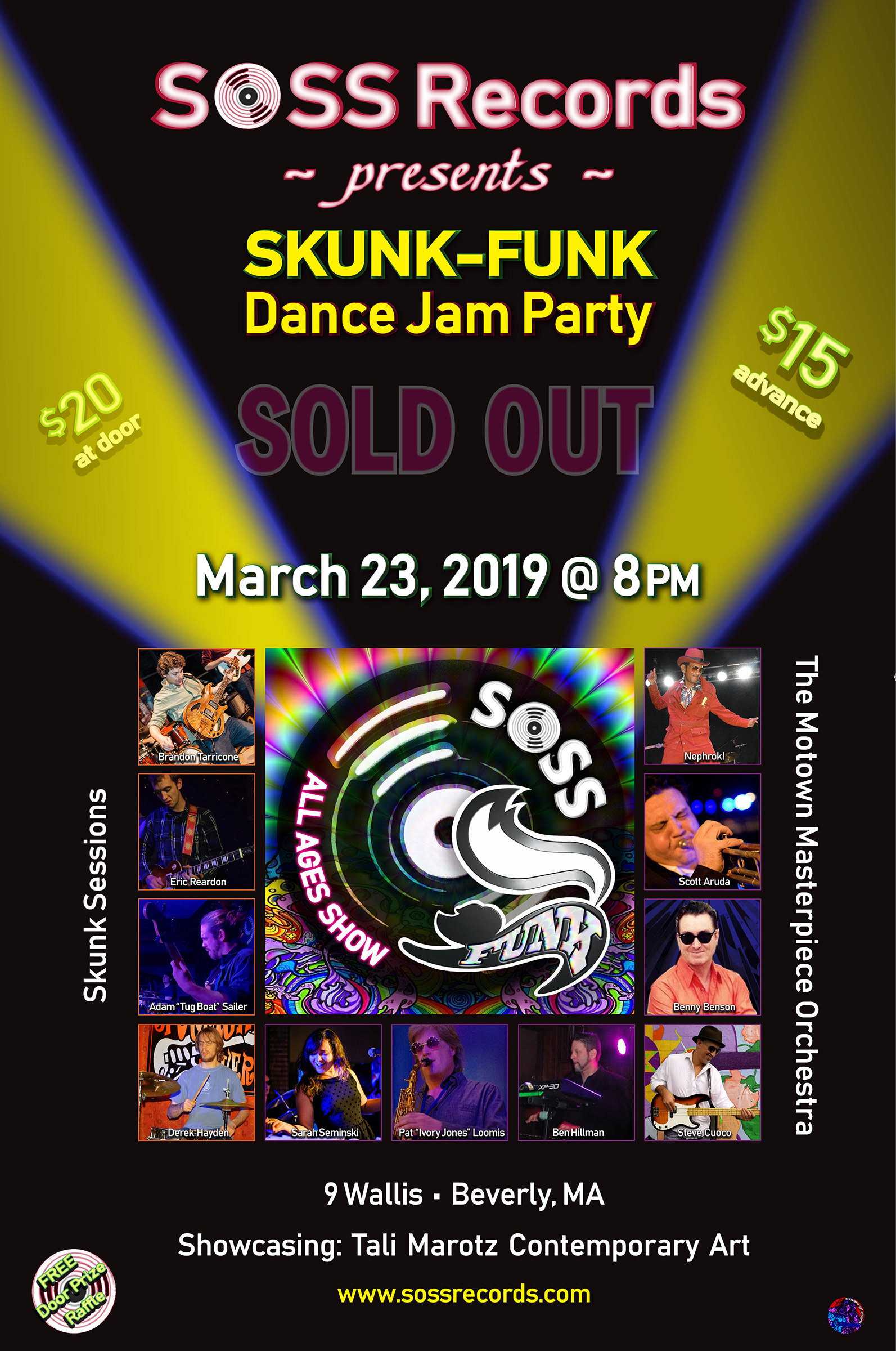
This event, as all others of this nature, was booked months in advance. Therefore, I was not prepared to determine a definite color scheme. The details I had when I began to prepare branding the event were the name (SKUNK-FUNK Dance Jam Party), the performers (Skunk Sessions and the Motown Masterpiece Orchestra), the location and the date. I figured the most relevant of these details was that this was a "party"! So I wanted a bright, joyful palette.
I incorporated the rainbow tie-dye pattern as a background for my graphic to keep my color options open as I moved forward. The graphic using green, red and yellow was used in the first social media posts and on the venue's website. As I collected the photos of the band members I found the most commonly recurring color was purple. But, the color that struck me like bolt was the orange of Nephrok's suit! That's how I got to the orange/purple combo that I used for rest of the campaign and collateral.
If you watch the video above or look at the promo poster below, you will note I adjusted the color in each of the band members photos to accommodate the palette. Most notable in the photo of Steve Cuoco, the mural behind him was primarily blue and pink. And, the picture of Derek Hayden as well, the wall and tapestry or artwork behind him was red. I also tweaked the Benny Benson photo for the promo poster to bring the background color inline with the other band member's pictures.


Auction Artwork Album Labels
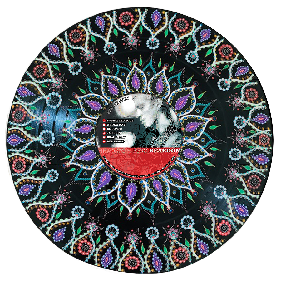
Tali Marotz Contemporary Art was commissioned to create art pieces to commemorate the SOSS Records anniversary. These pieces were auctioned at the SKUNK-FUNK Dance Jam Party. I designed the label artwork for the SKUNK-FUNK and Eric Reardon pieces. For Eric's album I was directed to start with CD artwork. I added a color burn layer of weathered wood to add texture. Above the texture layer I added a swirl design as luminosity to enhance the random nature of the effect. I laid out the song list as it appeared on the CD jacket and then added the event details around the bottom edge.
For the SKUNK-FUNK label I simply used the event branding graphic I created to promote the event. I added the event details around the edge and performer's details as they appeared in all promotional pieces to the left side. To promote the auction and allow show attendees to preview the items I created mock-ups of the two pieces for which I created labels. I requested high-resolution images of completed pieces from Tali and edited label artwork to these images to create the files below. Both mock-ups are featured in the video piece I created (above).
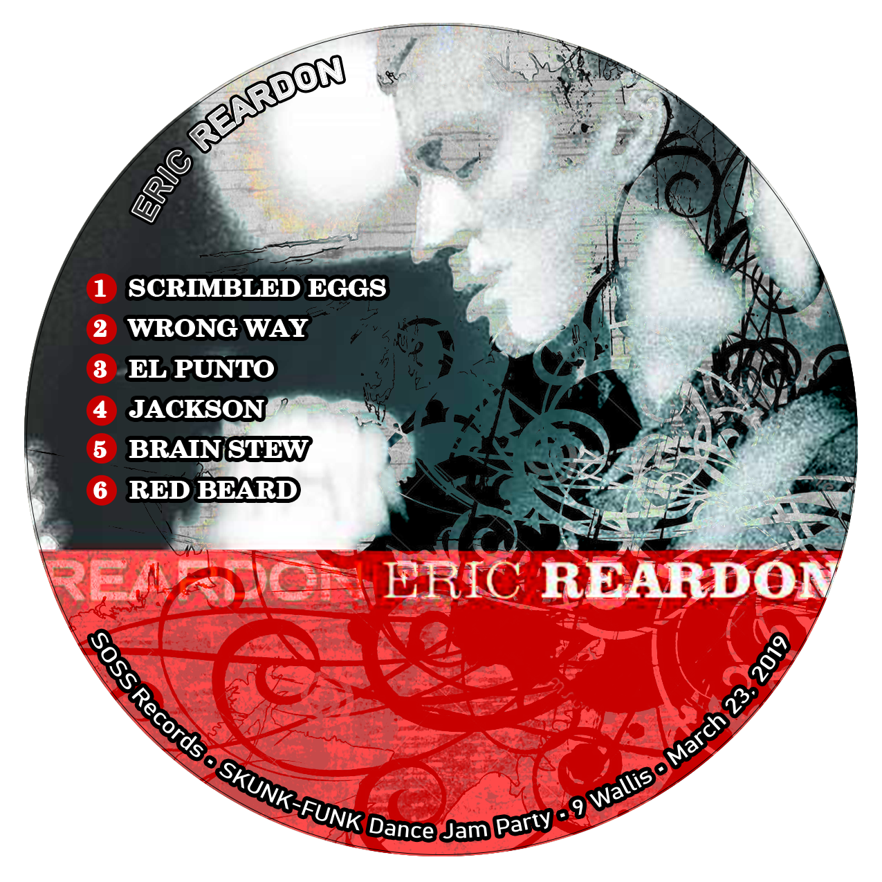
Eric Reardon Album Label Artwork
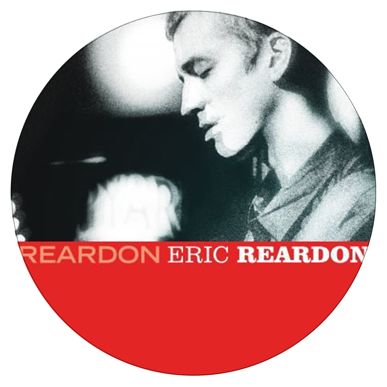
Eric Reardon CD Artwork
SKUNK-FUNK Album Label Artwork
Pre-Show Eric Reardon Album Promo Mock-Up Artwork

Pre-Show SKUNK-FUNK Album Promo Mock-Up Artwork
Event Poster

SKUNK-FUNK Dance Jam Party Promo Poster
Commemorative SOLD OUT Poster and V.I.P. Badge
Commemorative "SOLD OUT" Poster
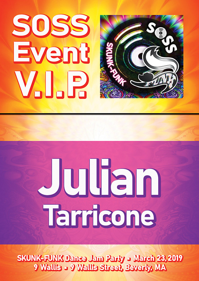
V.I.P. Badge
Event Signage
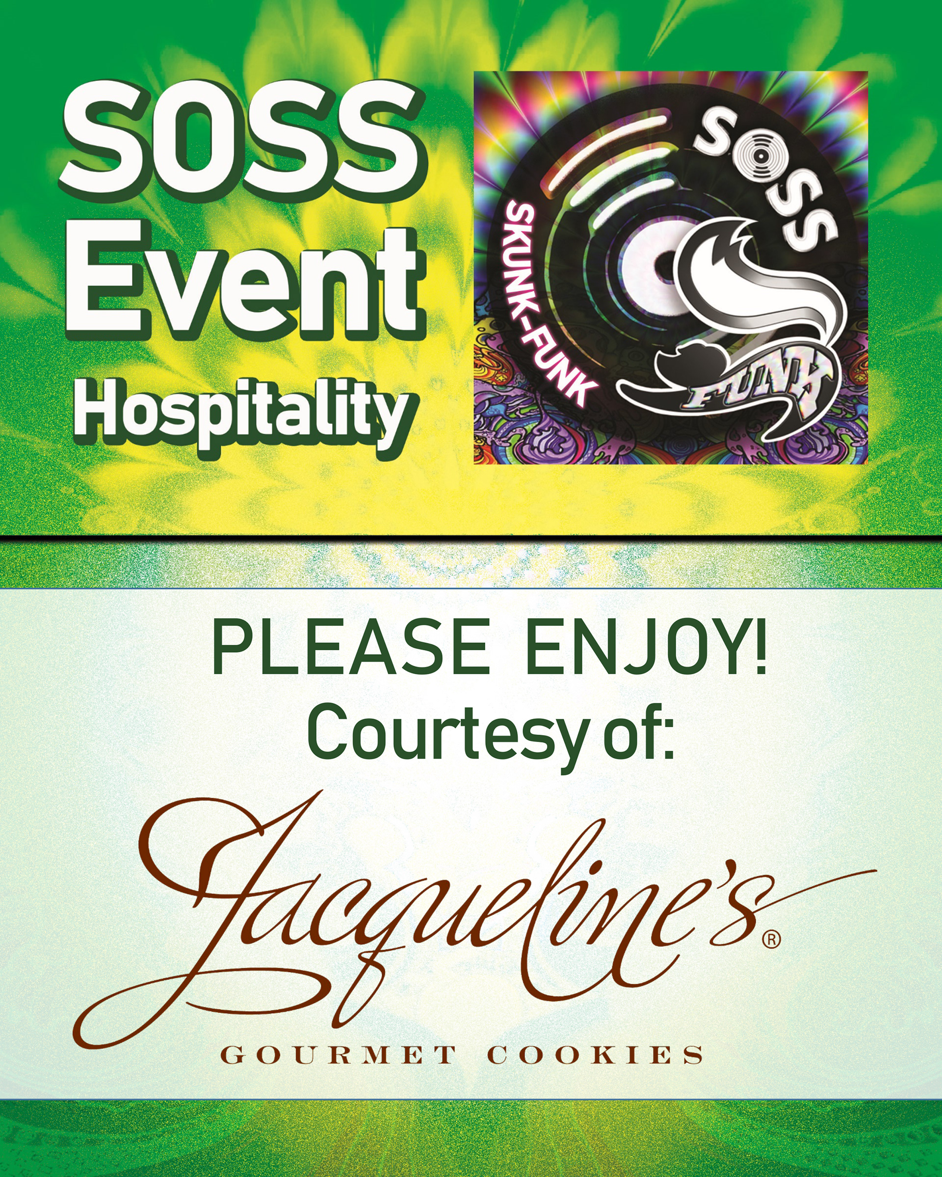
There were a few pieces of collateral needed for posting around the venue during the event. We had a V.I.P. section and a Green Room for the performers. Of course, I chose green as primary color for the backstage area signage. It was stocked full of sandwiches, snacks and beverages. Jacqueline's Gourmet Cookies was gracious enough to donate some tasty treats for event crew, performers and volunteers.
To achieve the effect for the Green Room sign I layered four radial gradients over the event branding background image. The first gradient, apple green to white, is blended as an exclusion. The second, lime green to white, is blended as a linear burn. The third, white center out to transparency, is blended as soft light. And finally, a copy of the third layer is blended as a dissolve. The top portion has two additional color layers. The first an apple green blend as saturation and over that a yellow overlay.
I wanted the V.I.P. Reserved table markers to be visible and legible in the dim light of the club so I choose yellow and deep purple. I adjusted the hue, brightness and contrast of the event branding background image. Then layered several radial gradients, lime green to white as an overlay and orange to white as hard light.
Green Room Sign

Reserved Table Marker
Event Promo Cards

Pre-Show Promo Card