SKUNK-FUNK Dance Jam Party
This SOLD OUT show required quite a bit of marketing and promo collateral including social media imagery, animated graphics, posters, VIP table markers, volunteer name badges and more. SOSS Records worked in concert with the two bands, Skunk Sessions and the Motown Masterpiece Orchestra as well as the venue, 9 Wallis, to promote the show. In addition to the performance, SOSS was pleased to showcase the artwork of Tali Marotz and to auction off custom pieces she created for the event. Please follow the SKUNK-FUNK link to see the full scope of work.

SKUNK-FUNK Dance Jam Party
Mahi Mahi Cruises
The Mahi Mahi All-Star Jam cruise was originally scheduled to set sail in June 2020 but alas, we all know why it was rescheduled for 2021... ugh. I had to update a few performers on that bright, sunny design for this year's event. I have several gradient layers under the SOSS Records logo "sun" to create the white, hot glow in the sky. And, added a cyan outer glow to the ship's blue drop shadow to enhance the "heat" and to add further dimension. I added a slight blur to the waves in the foreground to create a narrow depth of field with the ship as the point of focus. The porthole "frames" for each performer on the ship are not proportional but serve the purpose of featuring the band.
I did much less customization of the vector used to create the HDRnB design on the right. I filtered the photograph of Garret Savluk to create a cut-out and to match the palette of the vector. Four fonts are used in the design which is a lot for such a small space but three of them are used just once each for effect. The two script fonts used work well together though they are clearly distinct. Neither would work quite as well if used in place of the other. The font used for MAHI MAHI creates the illusion that the text is part of the background. It almost feels like a graphic element rather than text.
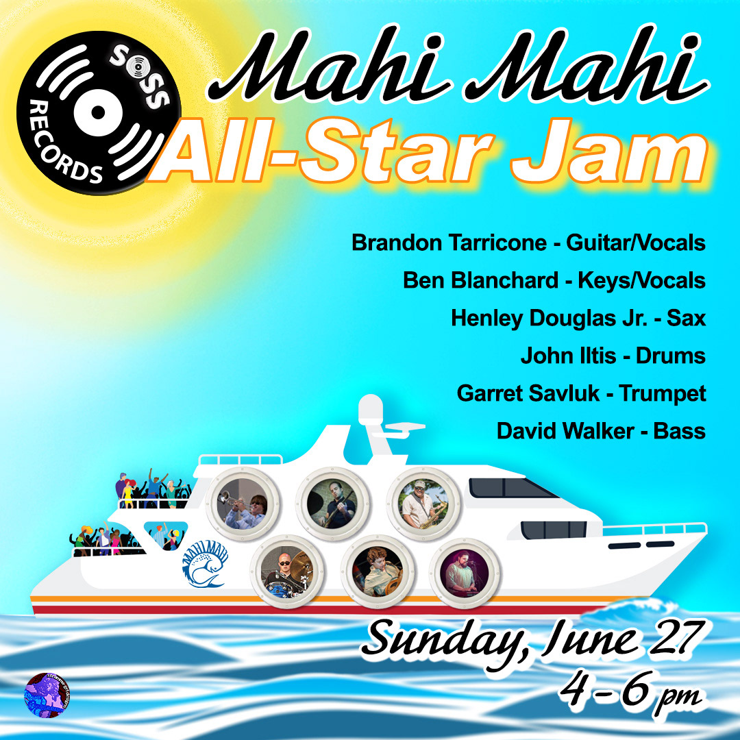
All-Star Jam Mahi Mahi Cruise
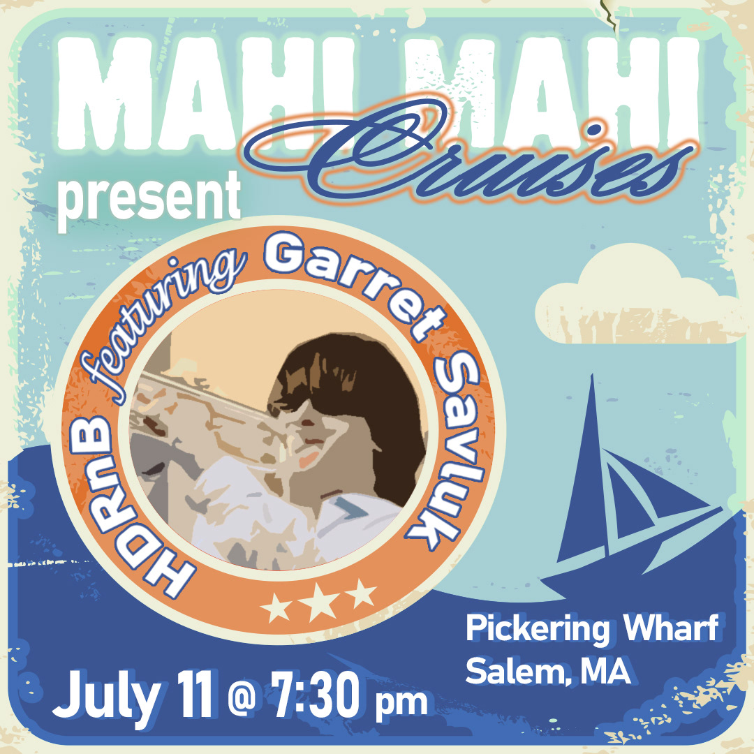
HDRnB Mahi Mahi Cruise
SOSS on the SOD
"SOSS on the SOD" is a rebranding of the "Backyard Staycation" series. The name change came about during a conversation among audience members at one of the events. Making the change was a no-brainer! However, these gatherings became so popular that it was no longer necessary to promote them... upcoming shows would SELL OUT during a previous performance BEFORE a band had even been booked for the date! The series ran straight through October 2020. Performers included Los Sugar Kings, The Soul Resonators w/ Qwill and The Syndicate to name a few.
I was actually disheartened that I didn't get to use this layout again, and again, and again, to promote more "SOSS on the SOD" shows. I really love this palette and the simplicity of the design. I probably would have changed this layout very little each time I used it. I did spent quite a bit of time editing the blades of grass in the foreground. The only other element that was the least bit time-consuming was drawing the sauce pouring over the SOSS. All I did was to add some poster edges to a photo of grass, adjust the colors to my liking and lay out the graphic and text elements. I'll find a way to repurpose this design... it deserves to be!
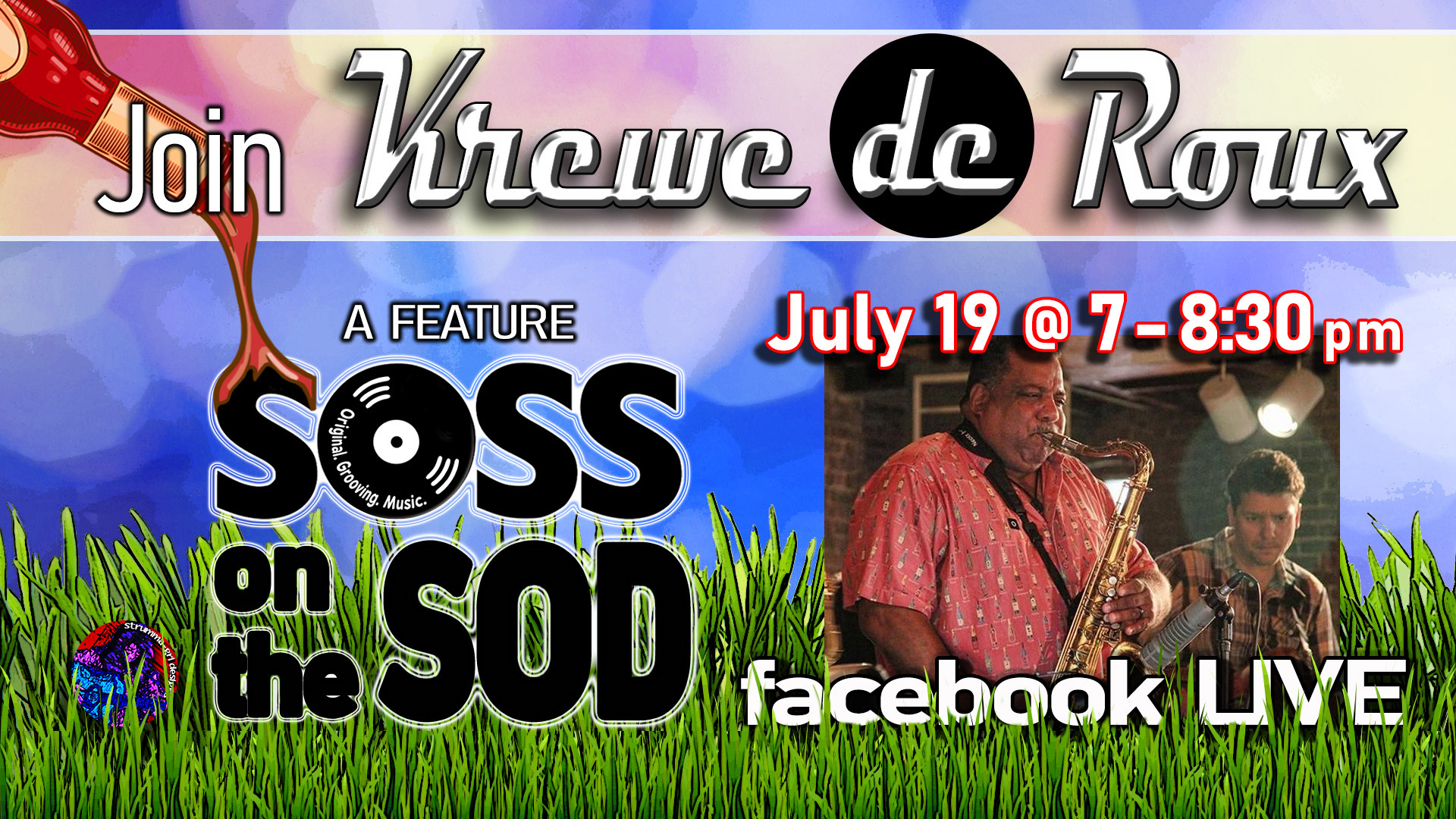
Krewe de Roux "SOSS on the SOD"
Backyard Staycations
As we are all well aware, in the summer of 2020, the COVID pandemic completely shutdown live performances worldwide. It was devastating for performers and audiences alike; not only were our social connections cut, our souls were deeply wounded. We had to find ways to heal our arts community. So SOSS Records launched the "Backyard Staycation" Live Stream series. These popular SOLD OUT events were small, invite-only gatherings that followed all COVID restrictions. We look forward to music returning to the stages around the world.
The Krewe de Groove design is based off the cover artwork for their album "Weightless". It looks like a bright summer day... why would I not use it?! I chose a font that resembled the text treatment of the band name on the album cover. For the HDRnB design I went with a photograph that was reminiscent of a typical New England backyard with a weathered deck or porch. The golden string of lights and deep green shrubbery perfectly complement the robust burgundy of the band's logo.
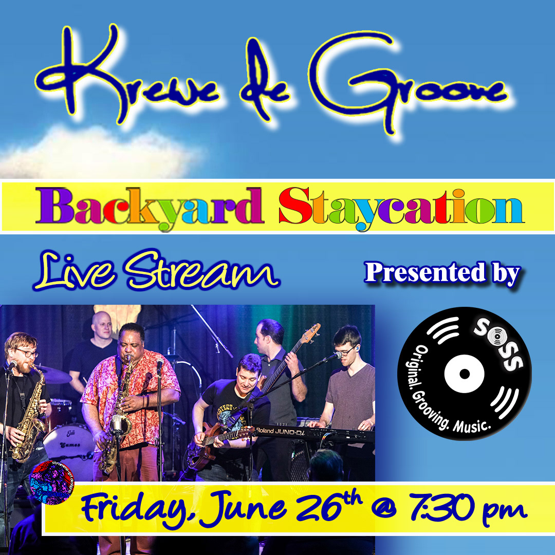
Krewe de Groove "Backyard Staycation"
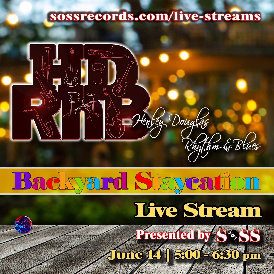
HDRnB "Backyard Staycation"
HMH/SRP Paradise Show
Unfortunately due to COVID this show was cancelled. But, it was in the books early 2020 for the Paradise Rock Club and all three bands, Heavy Metal Horns, Soul Rebel Project and Dub Boat. SOSS had planned to promote it heavily in collaboration with the venue and provided the artwork before the shutdowns had begun. We continue to hope to reschedule the show when live music returns to the stages of Massachusetts.
I used Adam "Tugboat" Saylor's striped tank as inspiration for the color scheme and graphic element to split the design space between the bands. The Heavy Metal Horns "collage" is made up of several photos of the band. Most already had a black backgrounds but some of the backgrounds were removed to give the appearance that it is a single photograph of the entire band. I also removed some distracting elements from the crowd in the photograph of the Soul Rebel Project.
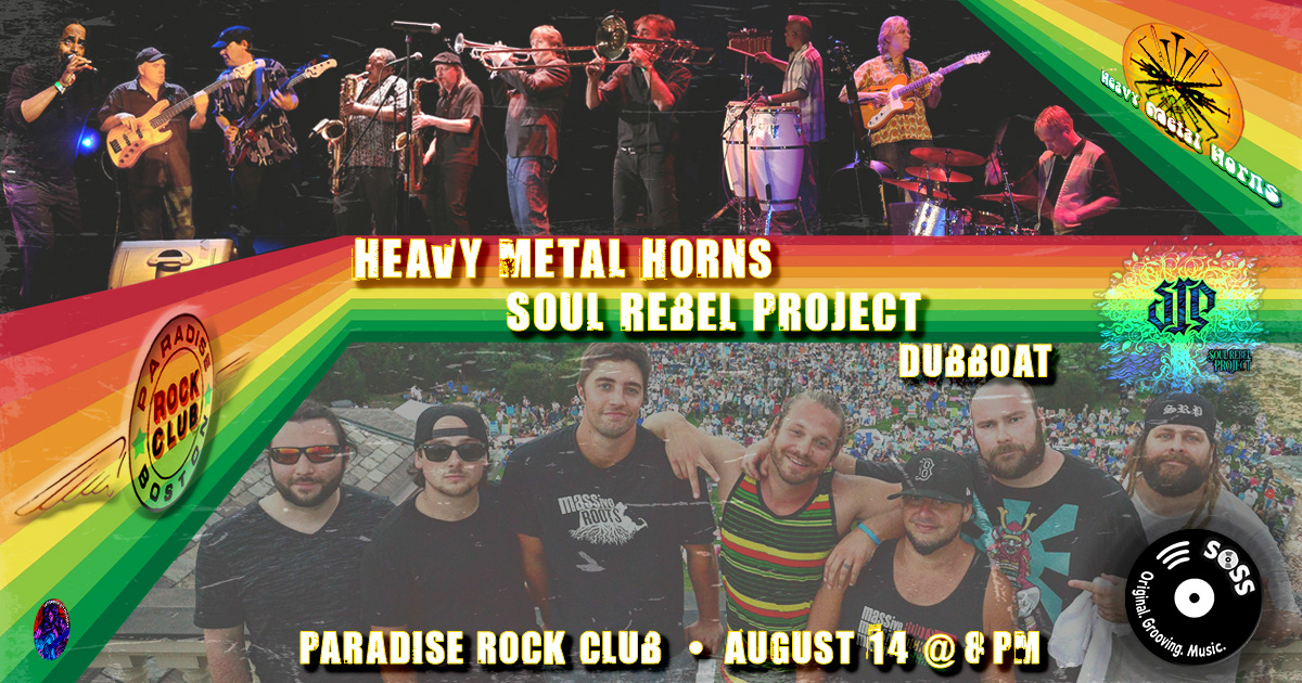
Heavy Metal Horns/SRP/Dub Boat @ the Paradise Rock Club
MAC Drive-In Shows
Again, most unfortunately, due to COVID both of these shows were cancelled. The pandemic took a turn for the worse just before the Krewe de Groove show and the MAC Drive-In shows were shutdown by law. We continue to hope to reschedule both of these shows when live music returns to the stages of Massachusetts with the folks at gimmelive.com.
I used old-fashioned drive-in theater signs as the inspiration for these designs. I tailored each sign vector for the respective band's desired graphic image. Krewe de Groove chose to go with a photo of the band and the Heavy Metal Horns with their signature "horn" icon. I like to use the SOSS logo as celestial body whenever possible. The background colors were pulled from the band photo which also worked with the Heavy Metal Horns text treatment. Though, the green was adjusted for each design to keep it inline with the design's palette.

Krewe de Groove @ the MAC Drive-In
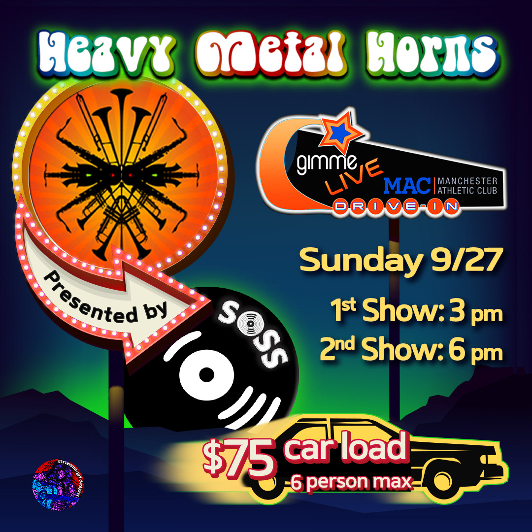
Heavy Metal Horns @ the MAC Drive-In
HDRnB - Temple Siani
As noted in the graphic below, HDRnB, was invited back to the Temple Sinai R&B Café after a stunning SOLD OUT performance in 2018. The marketing team at the venue created a lovely promo piece for this show. I borrowed the typography and colors of their poster for this social media event invite and website post. First and foremost, I wanted to maintain consistency in promoting the event and secondly, I loved the color scheme and layout of their design. I added the colorful swirl under the photo to tie in the dominant red hues in the band photograph. I applied a blue screen over it to keep the palette consistent.
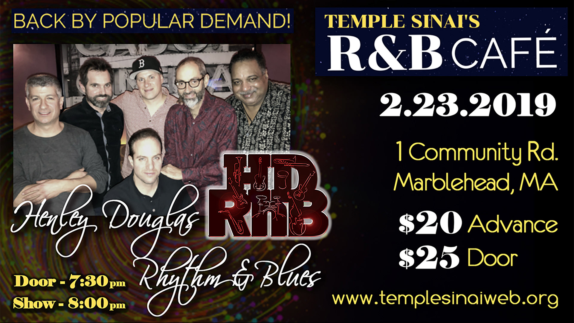
HDRnB @ the Temple Sinai's R&B Café
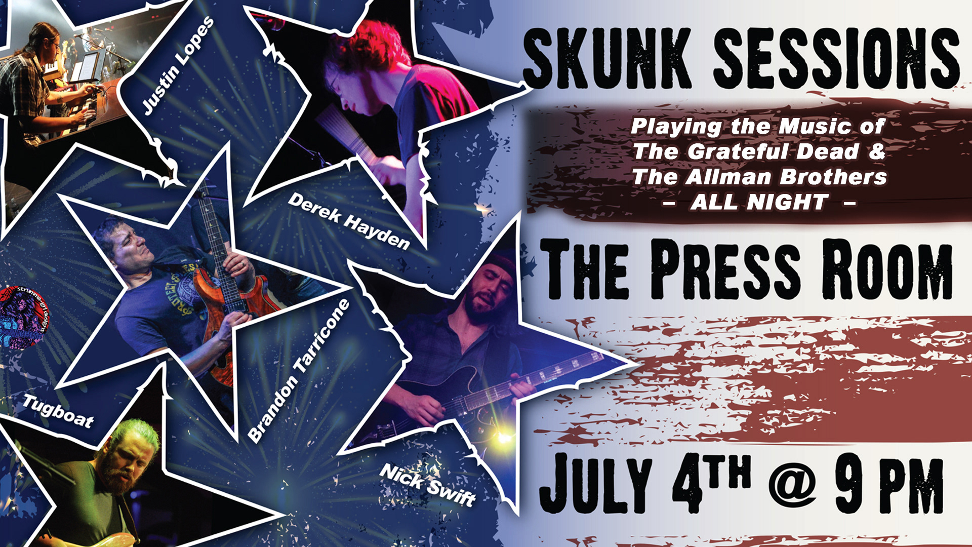
Skunk Sessions - Press Room
I enjoy creating promo pieces for Skunk Sessions, they are a joy to work with. This was an easy graphic to whip up... Independence Day?! Stars, stripes, a spattering of fireworks and call it done. The best part about designing for them is being added to the "guest list"... especially if it's a show at The Press Room – one of the best rooms on the East Coast.