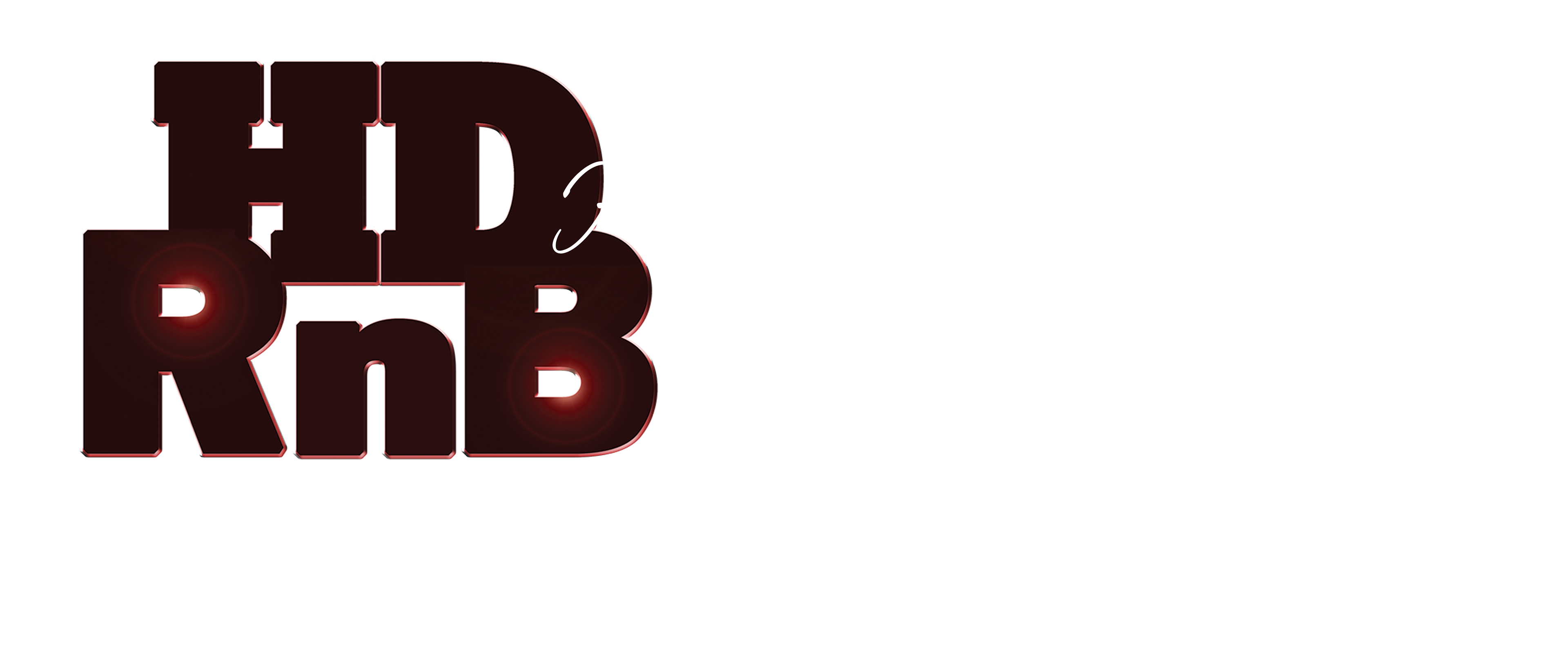
Henley Douglas Rhythm & Blues (HDRnB)
This was one of those designs that I imagined, put together, offered up for review and it was approved on the spot. However, a year later or so, a slight alteration was requested and that is the design below. The original design can be seen on the HDRnB banner design on the "SOSS Collateral" page.

HDRnB Logo Photoshop File with Lighting Effects

HDRnB Logo Vector File
HDRnB Logo Photoshop File with Script (no instruments)
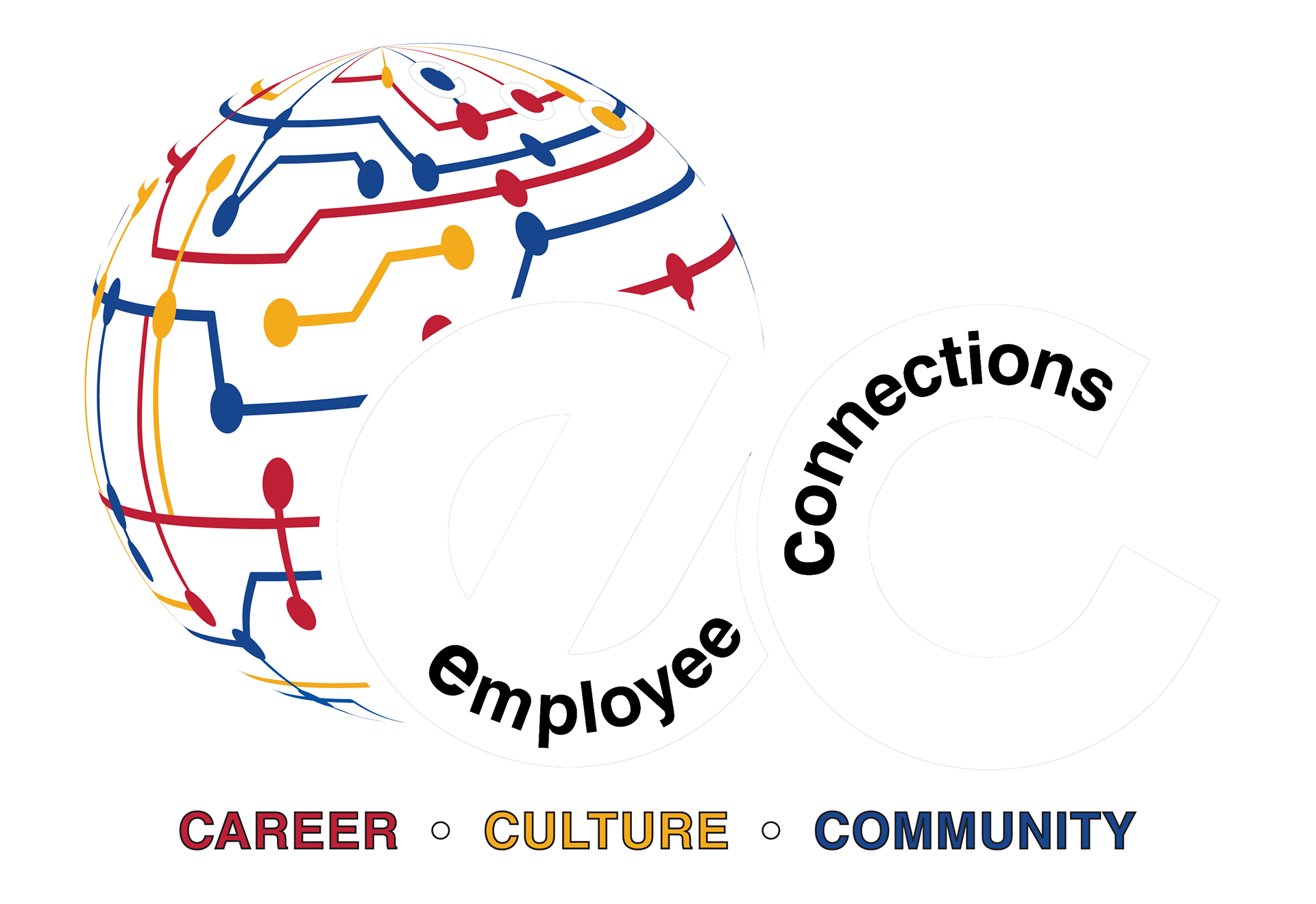
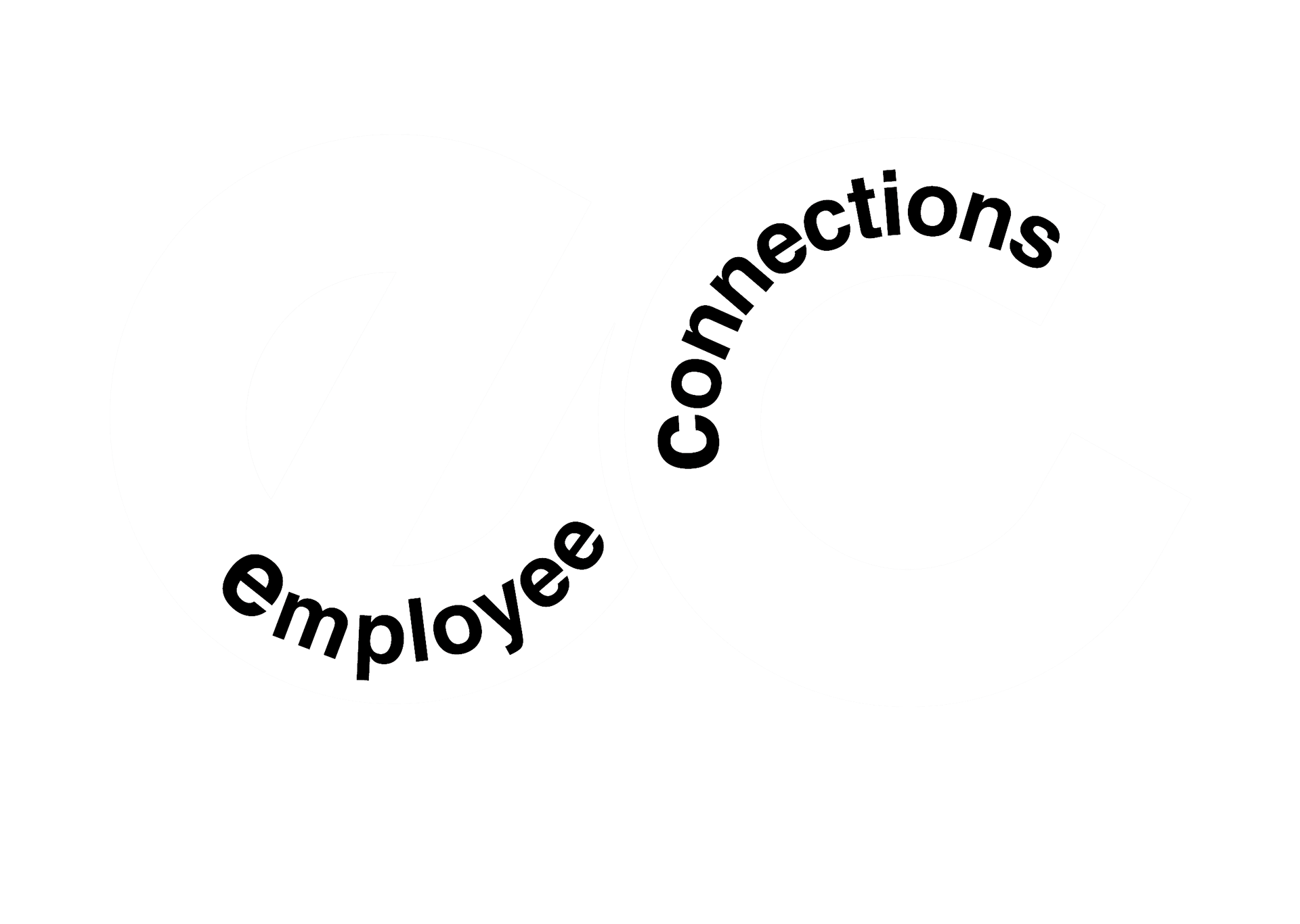
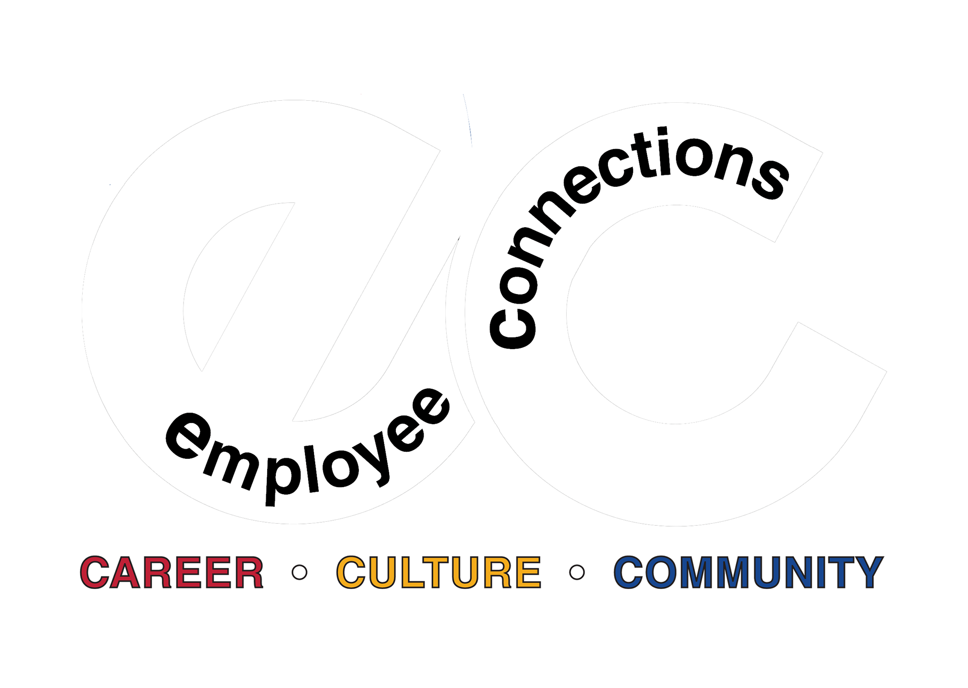
Employee Connections (EC) – The Kidde- Fenwal Employee Resource Group (ERG)
I developed several other concepts of for this logo but don't remember any of them. I do recall the concept my Marketing Director suggested. After she rejected my first round of comps, I envisioned this design and asked her to consider it with the idea she described. The two designs were submitted for review – she loved this logo immediately as did I! It pleased me to hear that she liked it more and more every time she saw it.
We used the 3 colors (red and yellow are Kidde Fire Systems' primary brand colors, blue is Fenwal Controls' primary brand color) to identify the key interests of the group's work – career, culture and community. The company employed team members around the world. Part of the ERG's mission was to connect our remote colleagues to their co-workers in the Ashland, MA facilities. This aspect of the group's work inspired the "connected" globe icon.
Employee Connections Logo - Color

Employee Connections Logo - White
Employee Connections Text Logo - White
Employee Connections Text Logo - Color
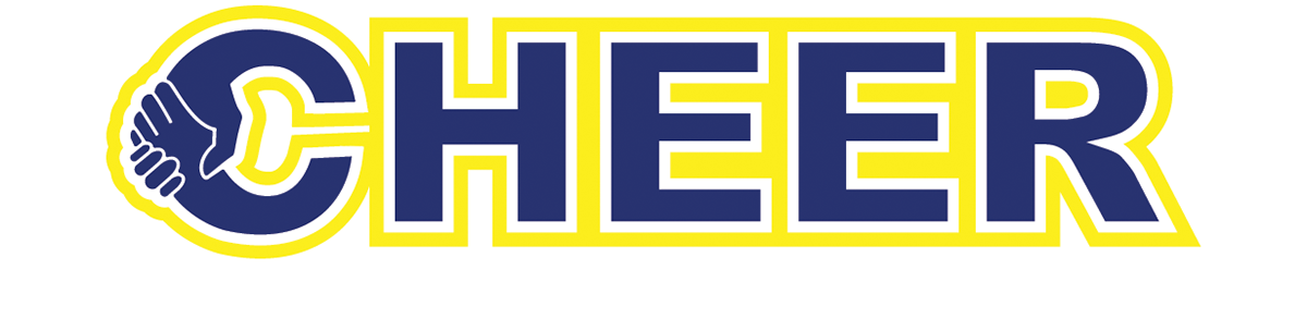
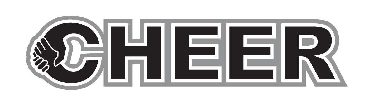
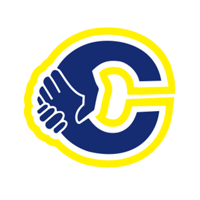
CHEER: Carrier Hispanic Employee Engagement Resource (Group)
I drew up three comps for this organization's logo to offer the team for review. As I recall, this design was pretty much a unanimous choice. Again, I don't really recall the other options. I developed the habit of discarding all of the rejected designs due to network storage space constraints and IT guidelines. Unless, I really LOVED something... which happens rarely.
I joined the group several months after it formed and they were using a text treatment of the navy lettering in a yellow box. I almost always try not to deviate far from established "brand" elements. So I kept the ERG's existing color scheme. Though, the Corporate Marketing team would later chose the color orange to represent the Hispanic/Latinx diversity group. I did turn to the Corporate Marketing team's D&I iconography (a heart shape formed by clasping hand) as my inspiration for the CHEER logo and icon.
CHEER: Carrier Hispanic Employees Engagement Resource (Group) Logo - Color
CHEER: Carrier Hispanic Employees Engagement Resource (Group) Logo - Grayscale
CHEER Icon - Color
CHEER Icon - Grayscale

CHEER Icon - Solid
iSPOT: HSSD Detector Logo
An iSPOT unit is a High-Sensitivity Smoke Detector. It was released in 2011 as part of the Air-Intelligence product line. I submitted a total of 6 designs, 3 of which can be seen below. The winning design was inspired by a transmission or radar signal. I have to say I truly enjoyed working on this project.

iSPOT Logo Decal
Winning iSPOT Logo Design
iSPOT: Rejected Logo Designs
Below are two rejected designs that I really loved. This was one of those rare projects that I was going to be happy with whatever choice was made by management. The design on the left was inspired by the classic "James Bond" opening sequence. The sight seeking it's target. The design on the right was inspired by the old adage, "X marks the spot." But, I also wanted to get a "spot" light vibe in there, too. Sooooo many possibilities!
Rejected ".007" iSPOT Logo Design
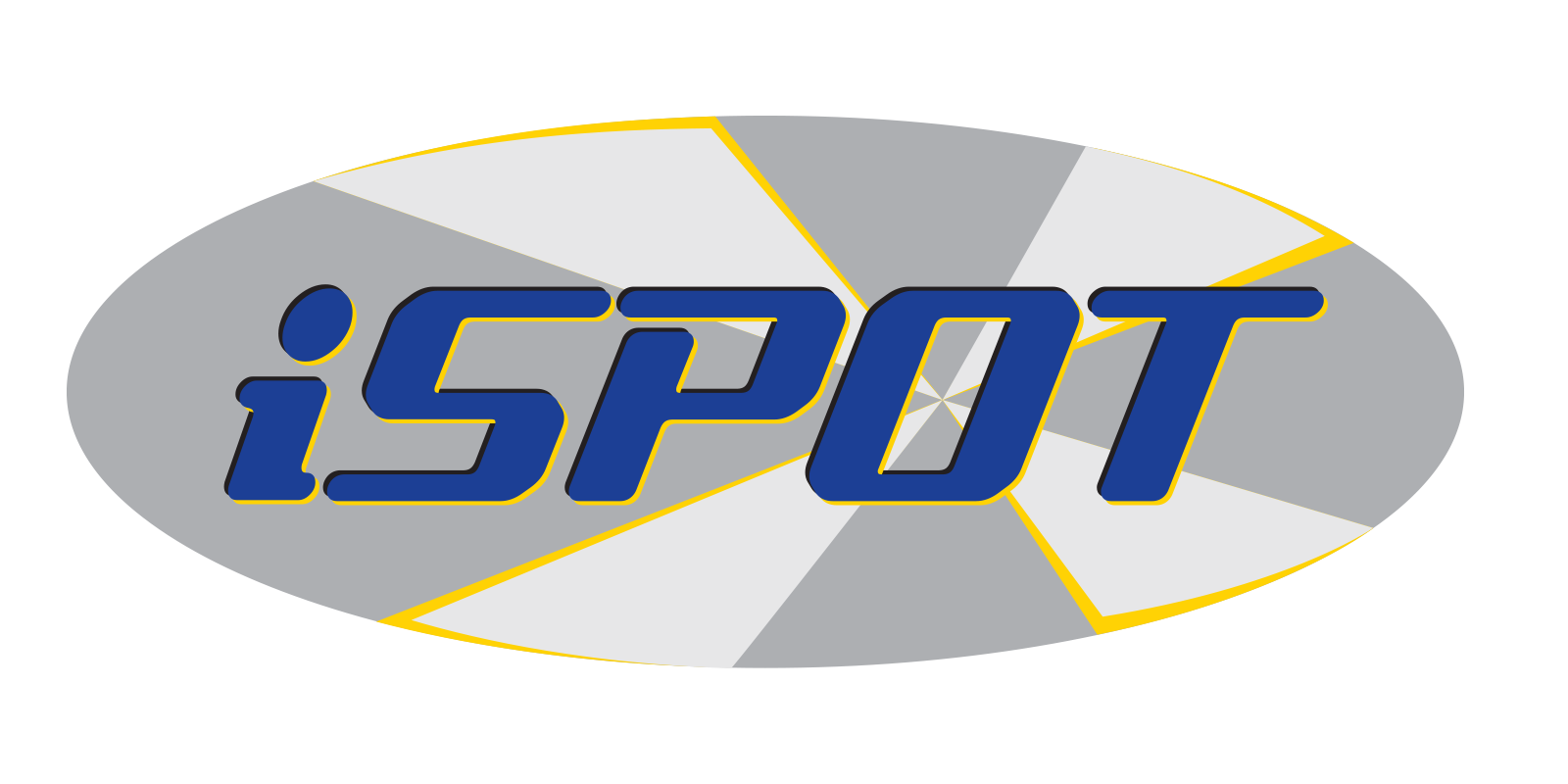
Rejected "X Marks the Spot" iSPOT Logo Design
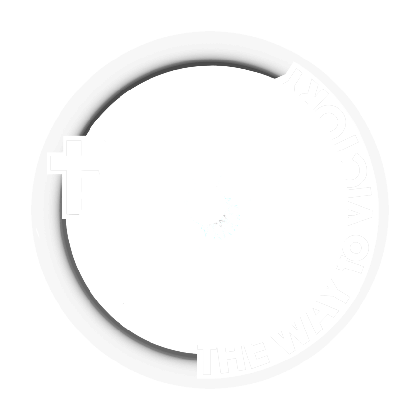
The Way to Victory Foundation
Though I started the concept for this iconography independently, the resulting design was a collaboration between myself and the foundation's leadership. Part of their work will include providing bicycles and accessories to needy children of Sullivan County, NY. The foundation will also sponsor an ultra-cycling team led by the organization's founder. This being the case, I decided to use a bicycle wheel as primary graphic element in the logo's design. The color scheme communicates the foundation's mission to provide hope and healing to victims and families who suffered trauma and abuse.
The Way to Victory Foundation is a faith-based organization so, the leadership was adamant about including the symbol of a 'cross' in their iconography. This graphic element informed the typography choice for the organization. The decision to include the spokes and wheel hub in the design was based on the desire to express the sense of community that begins within and extends to world around us. The wheel hub doubles as 'medal' dangling from the end of a ribbon (blue in the color rendition) intimated by the "V" for victory. I speak to the brand's color scheme on the "Non-Profit Design" page.

The Way to Victory Logo Vector - Color
The Way to Victory Logo Vector - White

The Way to Victory Logo Vector - Grayscale
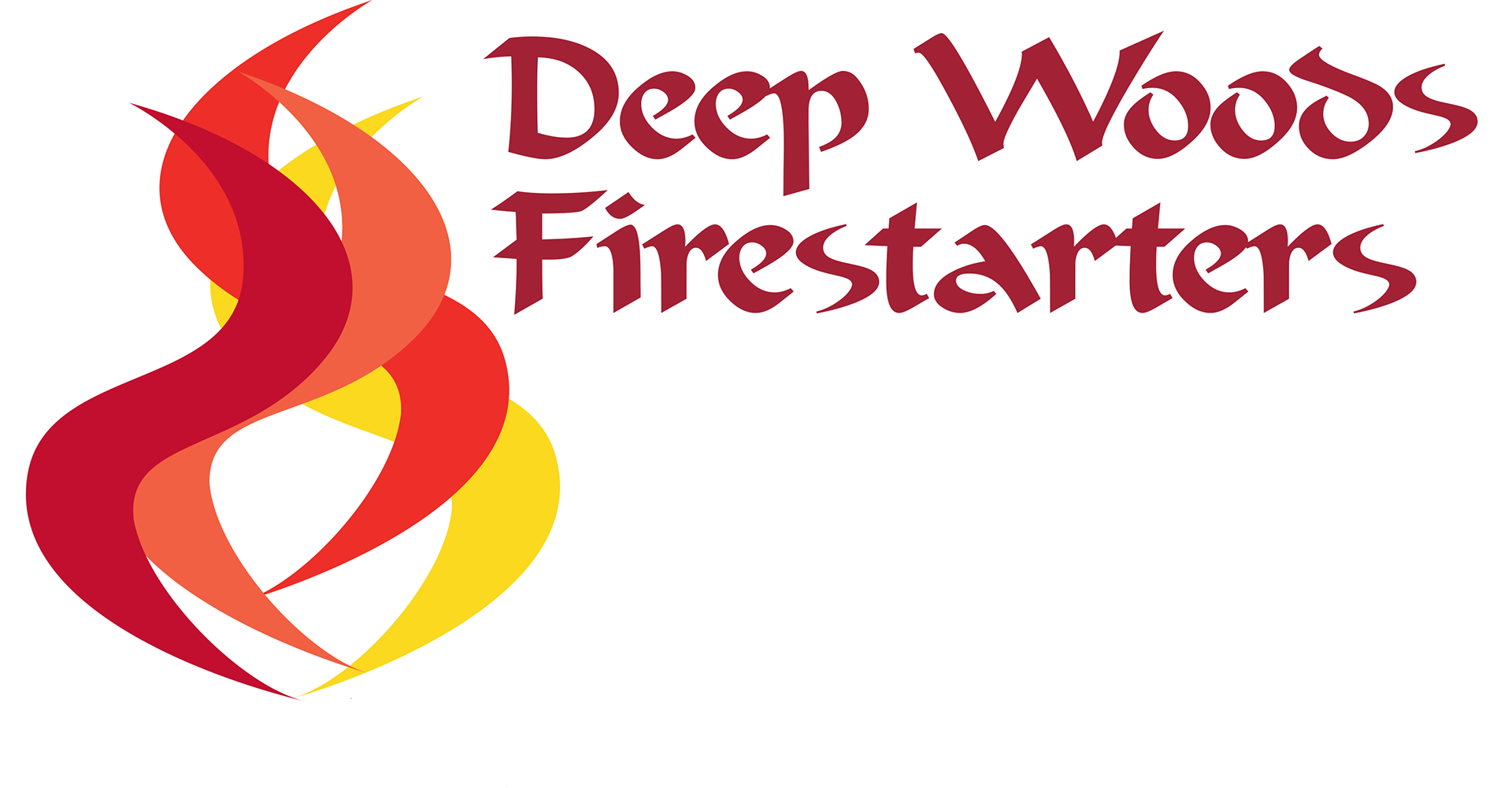
Deep Woods Firestarters
I spent the past 15 years working for a fire protection company. I can't say I understood the concept behind the logo. I was asked frequently about it so I thought about a "fire" logo for many years. This is the design that came to me... it's based on a "flame" that doubles as the letter "S". I think perhaps because the company had the word 'Systems' in the name. Count them – three S's in one word!
So when Ben Woods asked me to design a logo for Deep Woods Firestarters... it was already there. I substituted the letter "s" in the font I chose for the typography with the shape I drew for the flames in his icon. It is ever so slightly distorted – a bit shorter and wider than the flame as it appears in the icon. The one thing I did borrow from the Kidde logo to use in my "fire" inspired logo is shade of red for the front flame PANTONE 200C. Either it grew on me over the years or I was partial to it from the start. Can't say the same about the Kidde yellow!
Deep Woods Firestarters Vector Logo - Color

Deep Woods Firestarters Vector Logo - Grayscale
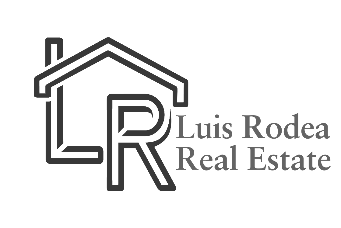
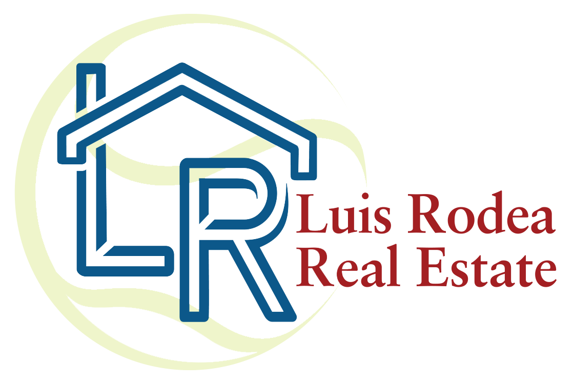
Luis Rodea Real Estate
This logo was a collaboration with the company's founder from the very start. He presented me with a couple of rough sketches that he had come up with. This design went through many iterations before landing on the design below. Luis loves to play tennis and did want to include some symbolism of his favorite pastime and passion in the design. A tennis ball is intimated behind his "roof and chimney" covered initials.
Another way I incorporated tennis into the company's branding is by way of it's color palette. The primary shade below is called "Courtside Green". The deeper tone was dubbed "Advantage Green". While the blue and red were named "Wellwater" and "Brick" respectively. Thought it would be a good call include some real estate related terminology!
Luis Rodea Real Estate Vector Logo - Color